Friday 30 November 2012

love and hate

Over the Summer we were set the task of creating two mood boards with the themes of' love' and 'hate' that summed up our personalities and were to be presented to the class on the first day: sort of an arty ice breaker.
Anyway, here is what I cam up with.

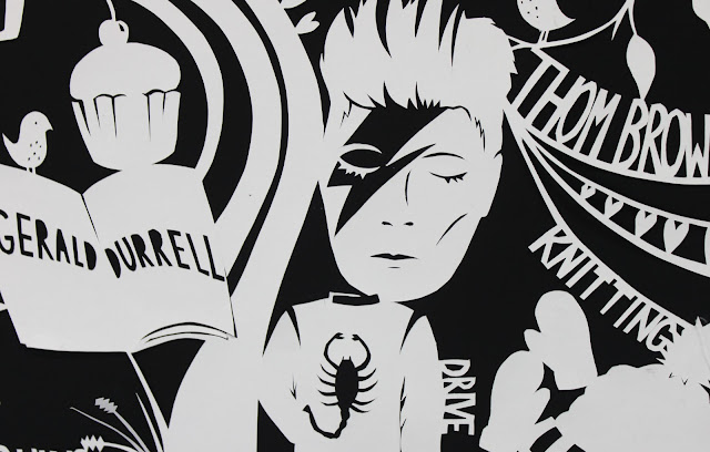
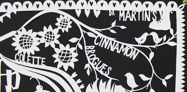
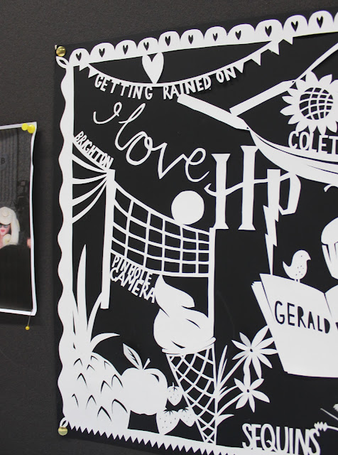
Love.
 This included David Bowie, beach volleyball, knitting, sequins and Dr Martens.

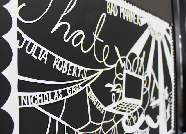
Hate.
 This included fake pockets, small yappy dogs, sunburn, and technology. Surprisingly the most controversial hatred of my turned out to be Julia Roberts. Who would have thought?


Wednesday 28 November 2012

personal work

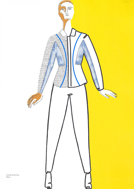
Here are a couple of fashion illustrations I did the other day, probably when I should have been working on my shirt project -I expect I'll get around to uploading that soon.

fine liner and water colour

biro

Thursday 8 November 2012

illustration project

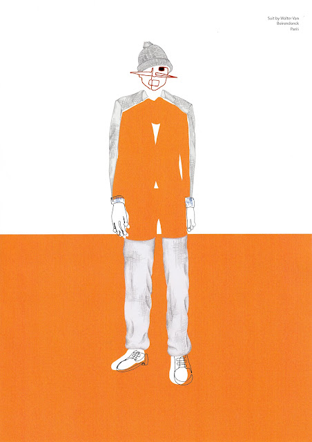
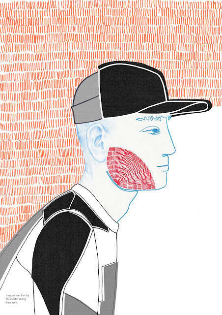
Here are my 6 final illustrations plus front cover and editorial page.
All clothes were selected from the a/w 2012 fashion shows for my theme of colour blocking and shapes that distort or play with the body's silhouette and proportions, I chose to aim them at Dank magazine.


Wednesday 7 November 2012

Tim Walker: Story Teller

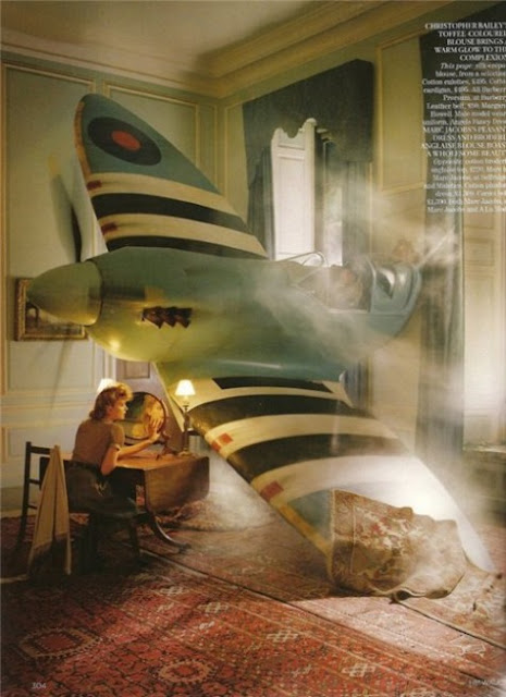
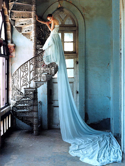
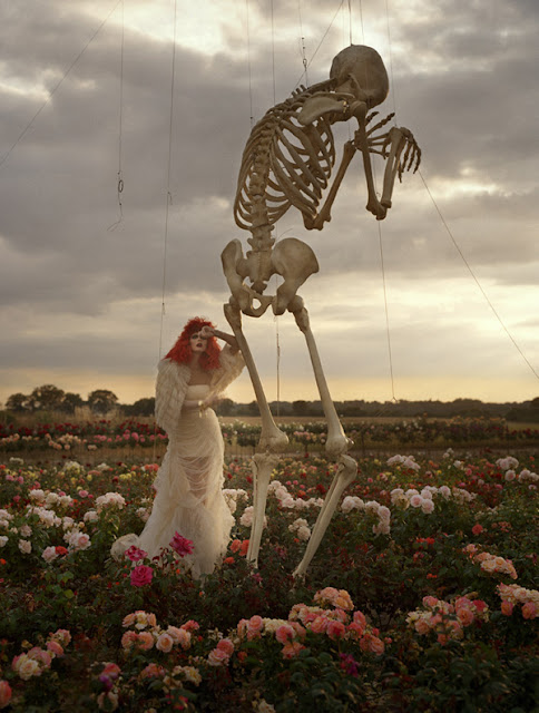
The other day my sisters and I went to see the Tim Walker: Story Teller photography exhibition currently on at Somerset House. It was absolutely stunning to see his photographs on such a large scale rather than in magazines or on the computer screen which in themselves are impressive. 


There were also a load of the original props from the shoots -this guy's budget must be limitless


Tim Walker is my favourite fashion photographer, in fact, my favourite photographer full stop! I wonder if it is the amount of money that is used to create his shoots or whether it is just some spark of brilliance that he has that no amount of money can give you? Because surely other people can splash out on extravagant props and locations, but no one can create such believable and enticingly mystical other worlds quite like Walker does.

Tuesday 30 October 2012

shop report


S H O P    R E P O R T

By

F L O R A   P E T T I T T
the super-ordinary vs. something out of the ordinary
 
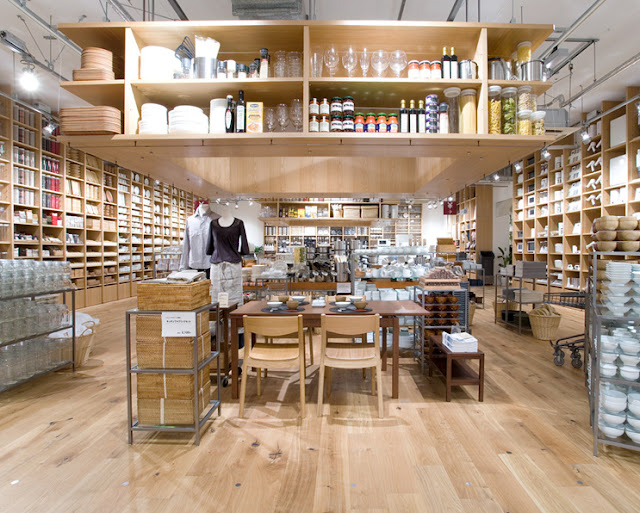
Muji was founded in the early 80’s in Japan with the basic principal of providing ‘no brand quality goods’. The materials Muji uses are specially sourced from all over the world to be economical and recycled where possible, whilst all the time maintaining a high standard of quality.
Products do not carry a brand name but are usually instantly recognisable by Muji’s distinct aesthetic quality, a direct contrast to most retailers today where people buy products because of the brand name and the status that comes with the label. Muji has done many collaborations with famous designers, including Yohji Yamamoto, but does not usually disclose which products are made by who, Yamamoto was not even mentioned on the white ‘labo’ collection label, this again puts all the emphasis on the quality of the product rather than the brand or designer’s reputation.
The clothes are simple and carefully thought out. The colour palette, like the rest of the shop, reinforces the overall brand identity; white, black, grey navy blue and beige with the occasional detail of red. Of course Muji could be seen as bland or boring to those who prefer more variety of colour and visual stimulation.
The shops themselves –of which there are over 300 worldwide- have a very distinct spacious light quality to them. Items are stacked neatly in rows and columns and separate compartments on ceiling high shelves lining the walls, and clothes hang in orderly little groups interspersed with other products.

They are reasonably priced with women’s jeans for £36 and a striped boat neck top at £29. The shoes come in very simple sizes; Small Medium Large XLarge. Some of the shoes are unisex, the only difference being that the women’s are sizes 4.5-6 and the men’s carries on from 7-9. The cheapest shoes are the Unisex flip flops starting at £2.45 a pair.
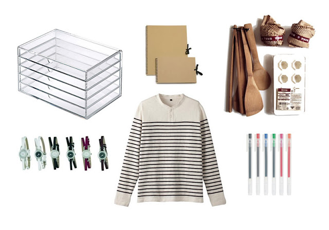
It is unofficially acknowledged that your obsession with Muji starts with the stationery, buying beautifully simple matching pens and notebooks which quickly morphs into buying a few kitchen implements and before you know it you’ve kitted out your wardrobe and house in Muji products.
Irregular Choice is more expensive than Muji; a cotton jersey sweater with printed image for £79.99 and shoes that vary from around £60 to £80 for a standard pair of heels, and up to£260 for collaborated designs.
Irregular Choice was created in 1999 in Brighton by Dan Sullivan, their philosophy is to maintain and champion creativity and individuality. Where Muji is all about minimising unnecessary design features and excessive decorations, Irregular Choice can’t wait to pile it on. As well as shoes they sell bags, clothes and other accessories all of them covered in pattern, colour, glitter and frills.

The stores are vibrant and energetic, each one is done up differently with the intention of transporting you into a whimsical other world, the walls and floor are decorated in colourful designs and the shelve on which the shoes and bags sit are covered in mirrored tiles.
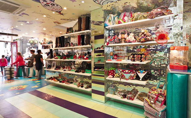
Frivolous and extravagant, one could say that Irregular Choice shoes add a splash of excitement into mundane, stressful everyday life whereas Muji provides products that introduce calm and peace into their customers’ lives. Shopping at either Muji or Irregular Choice is seen as a definite lifestyle choice; Irregular Choice appeals to people with an eclectic sense of style –the shoes and clothes are so lavishly decorated they are unlikely to ‘go with’ or match many outfits the customer already has. This is the polar opposite to Muji in which the aesthetic style is so neutral that anything bought from there, be it clothing, shoes or bed linen automatically goes with everything else from there because the overall theme of minimalism and colour palette are so strong.
Both brands’ London shops -irregular choice on Carnaby Street and Muji on Oxford Street, are painted red and yet still manage to convey completely different atmospheres. The flowers, scrawled typeface and glossy bright red paint of Irregular Choice are utterly different to Muji’s matte, dark red and deliberately simple exterior of straight lines and large glass display window.
The one thing the two brands do have in common is that neither of them particularly follows trends. While the shops around then slavishly follow the latest fads and styles to try and attract more consumers, these two rely on the cult-like following of loyal customers -built up in the majority by word of mouth- to keep them going. The clothes will vary from season to season but Muji will always provide simple, well designed basics and Irregular Choice will always produce flamboyant brightly coloured shoes.


spring summer 2013 show report


S / S   2 0 1 3    S H O W    R E P O R T

By

F L O R A     P E T T I T T


C H E C K  and  P L A I D

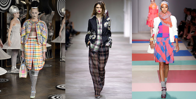
 The plaids at Thom Browne came in bright red, yellow and blue, light green and orange as well as in black and white. Most of the outfits contained two or three versions of check and plaid in different colours and sizes with some cut on the bias, which all produced a slightly hectic but fun and energetic feel.  At Dries Van Noten the designs came in slightly more subdued colours than at Thom Browne; pale blue, dusty green burgundy and brown, and used unusual fabrics; taffeta, organza, mousseline, and lamé to keep it feeling feminine, but there still seemed to be the inclination that one tartan is simply not enough and up to 3 different designs found themselves layered up on the same outfits often with large flower prints thrown into the mix.
At Marc by Marc Jacobs the checks were brightly coloured in pinks, oranges, and blues often diluted somewhat with items in grey and dusty brown. The sizes varied from either very small on bags and scarves or else so huge they hardly resembled checks anymore, the look carried from head to toe with gingham and checkered shoes. The whole collection had a distinct gypsy feel to it as a result of all the layering, headscarves and brightly clashing prints.
To me plaid can often feel more Winter than Summer –think woven shawls and blankets and thick warm shirts- but the bright colours or light and airy fabrics chosen by the designers made sure that this trend is a thoroughly Summer one.
M O N O C H R O M E
Both Moschino and Sass and Bide used contrasting piping in their monochrome outfits which gave them a very graphic, outlined feel, Moschino especially used black and white edges to almost draw details and design features onto the clothes. At Balenciaga, Ghesquière too, used black and white to create striking shapes in his designs. As the models walked down the runway, skirts with long slashes or cascading, undulating hems that moved sensually with the wearer, revealed double sided fabrics creating a variety of exciting and changing shapes.
At Roberto Cavalli we saw extremely intricate black detail on sheer and light fabrics that produced a much softer approach to monochrome. Ralph Lauren spiced up his striking white tailored suits with splashes of red and purple in the form of silk scarves tied round necks and poking out of breast pockets.
 
C O L L A G E
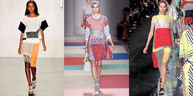
Patchwork and collage themes have an inherent Summer feel especially when done in the bright colours and light weight fabrics that we saw this season.  From New York there was Helmut Lang where the patchwork was very structured and defined in black and white with vibrantly contrasting pops of orange. A key part of this patch work style is that the garments are not symmetrical, Helmut Lang emphasised this by using varying thicknesses and of cloth; opaque and semi-transparent, especially for the hem line, drawing attention to the unevenness.
Marc by Marc Jacobs accessorised with large tied waist bands and head scarves for a distinctly relaxed, bohemian look. He also combined a variety of prints; blue and orange check, blue and white gingham and decorative purple swirling patterns, strips and panels. In Paris, Issey Miyake’s style of patchwork was much more graphic; black and white stripes clashing with bright primary colours and sheer fabrics creating optical illusion style pieces.
C O C O O N    S L E E V E S
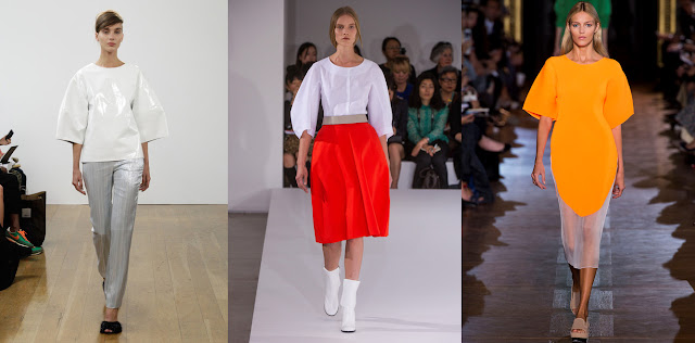
A wide, loose sleeve that hung down to just below the elbow was seen at a number of shows this season; Eudon Choi gave us the style in stiff patent leather while Jil Sander used soft white cotton for a relaxed yet still structured look.
This style of sleeve creates volume round the mid section of the body mimicking the bell shape of the hips and skirt and producing a rounded, cocoon shape overall. It is, in my opinion, most effective when in a plain fabric, emphasising the exaggerated silhouette, or in a brighter block colour for more impact such as at Stella McCartney. There is something very satisfying about the smooth lines and gentle curve falling from the shoulder, ending abruptly at the elbow.
W H I T E   on   W H I T E
This season white continued to be a strong theme with many   designers featuring it in their collections and a number of entirely   white outfits with white on white decoration and embellishment. Most designers who sent full white outfits down the runway chose a variety of fabric to break up the monotony of the colour, such as Roberto Cavalli who combined leather with softer fabrics; lace and chiffon, carefully placed slashes and intricate beading, and Emilio Pucci whose heavily beaded and embellished jackets framed layers of soft organza that gave off an air of delicate femininity. Christopher Kane’s embroidered jackets and dresses on the other hand, looked thick and heavy, almost quilt- like, and Comme des Garcons presented us with piles of draped fabric in varying shades of bright white and cream that became abstract with the addition of sleeves in unexpected places. They almost make me think of calico toiles that have gone horribly wrong or been put together in the dark. The Comme des Garcons collection also featured thigh length, bright white manes of hair that almost became part of the outfits.


Saturday 27 October 2012

illustration


outfit: jeremy scott for adidas
illustration in water colour, acrylic paint and pencil.